Discover familiar works anew: from Van Gogh’s sun-soaked pigments to Christo’s vast ribbons of colour, our curators offer expert investment advice paired with insights on art you love.

Sometimes, the more well-known an artist is, the harder it becomes to experience their works authentically. A name alight in stardom and sensationalism can sometimes block the viewer from experiencing a work, dulling the quiet, profound intimacy that connects us to the art itself. For all the art collectors that approach our advisors at Artelier, investing in art is always about more than financial returns; it’s about owning pieces of history and creativity that they truly love.
With this in mind, our curators have sought to illuminate iconic names from fresh angles, reigniting your imagination. Through rigorous academic research into blue-chip names like Vermeer, Van Gogh and Christo — paired with thoughtful investment advice — we aim to bridge the art market’s hard edges with the softer beauty of visual poetry, so you can make investment decisions from the heart. Above all, we reframe these works through the visual qualities that defined them. How does an artists' choice of colour command emotion, cast meaning or hold sway over the viewer?
This essay is the second in our investment series on colour, following “All About Blue”. Perhaps you’ll find yourself curating a collection built on the emotional pull of colour. And if not, simply revel in the world of yellow, a sacred shade. The colour of sunshine, fire and dawn.
Index of Artists
Click on an artist's name to jump to their section
1632-1675
1853-1890
1866-1944
1903-1970
1935-2020 & 2019
1967-
—

When this symbol appears, you'll find key investment advice.
A Brief History of Yellow
Yellow flickers across our world today — cars in the rush-hour blur, wild daffodils in the march spring, the first cut of sunlight over a sleeping city. But, in nature, it’s extremely rare. The colour of deserts and dying leaves, of sunflowers and goldfinches, yellow appears in flashes — brief, striking, impossible to ignore. For millennia, artists have sought to capture it's beauty and scientists have sought to create it.
The story of yellow pigments begins with yellow ochre, sourced from iron-rich soils, riverbeds and cliffs. Anthropologists believe prehistoric people discovered its potential by noticing the yellow stains left behind on certain earths and then grinding them into powder and mixing them with animal fat, water, or plant sap to create paint. Cave paintings at Lascaux, France (circa 17,000 BCE), stand as vivid evidence of its use.


By the Middle Ages, yellow took on new complexity. Lead-tin yellow, slightly green-ish and born from the alchemical fires of powdered lead oxide and tin oxide heated to 900°C, it appeared in frescos, manuscripts and religious iconography, often symbolising divinity (see Giotto's Lamentation on the right). Ultimately, though, its meaning was never fixed. In Western art, it soured, tainted by its association with Judas and treachery. In China, it was exalted, considered imperial and sacred; it was reserved for emperors as representative of the colour of the sun itself.

As trade routes expanded, so did yellow’s palette. The Baroque era introduced exotic pigments transported along the Silk Road — gamboge, a resin of the Garcinia trees from Southeast Asia and Indian yellow, a luminous hue derived from the urine of cows fed mango leaves. These pigments, prized for their intensity, brought new brilliance to art, enhancing glazing techniques and dramatic compositions.
The 19th century, propelled by the Industrial Revolution, saw breakthroughs in pigment chemistry. Chrome yellow, a striking yet toxic colour, found fame in Van Gogh’s sun-drenched paintings before being replaced by cadmium yellow — a safer, more durable alternative that remains a staple in modern palettes.
In the 20th and 21st centuries, synthetic pigments like azo yellows expanded the range of shades, offering affordability and vibrancy.
Yellow is a colour that began in the earth, since transformed by chemistry and culture. It moved through hands, through fire, through chemistry labs, through time. And still, it shapes the way we see.
Johannes Vermeer


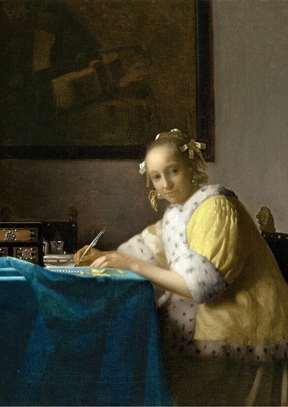


Left to right: Johannes Vermeer, Woman with a Pearl Necklace (1664), A Lady Writing (1665), Lady with Her Maidservant Holding a Letter (1666), Oil on canvas

Aptly named the "Master of Light", Johannes Vermeer lived and worked in Delft, at the heart of the Netherlands. A near-mythic figure, he left behind no letters, no sketches — only 36 surviving works. During his lifetime, he toiled in obscurity, his paintings selling for around 100 guilders (roughly £2,000 today). Now, a Vermeer could fetch upwards of £200 million.
Yellow plays a defining role in Vermeer’s paintings, appearing in radiant pockets throughout his compositions. In the 17th-century Dutch Golden Age, yellow symbolised wealth, vitality and optimism. It adorned the rich brocades of high society and evoked the celestial glow of sunlight — a mark of ascendance. Vermeer understood this power instinctively. He worked with lead-tin yellow, a buttery, brilliant pigment; earthy ochre; and the rare yellow lake, an ephemeral dye extracted from plants. Layered masterfully over underpaintings of charcoal black, lead white and muted ochre, Vermeer used paint expertly, producing an almost alchemical glow on his canvases. Unlike his contemporaries, who framed their interiors with stark white walls, Vermeer embraced shadow, allowing golden hues to shimmer like embers in the dark.
This sensitivity to colour is part of what makes Vermeer so cherished. His paint doesn’t just sit on the canvas. Instead, careful pigment layering creates a quiet luminescence, as if the light emanates from within. A woman stands by the window, her yellow satin robe catching the light, its glow pooling onto her skin. Another bends over a letter, the flicker of daylight tracing the ink, the quill, the curve of her cheek. These vignettes are not just studies in beauty but in perception itself. Vermeer’s light lingers, not merely illuminating his subjects but imbuing them with meaning, making the quiet act of looking feel like revelation.
For collectors and enthusiasts, Vermeer remains both elusive and coveted. The Mauritshuis in The Hague houses key works, including Girl with a Pearl Earring, while the Rijksmuseum holds others, such as The Milkmaid. Vermeer’s art rarely appears on the market, but in 2004, Young Woman Seated at the Virginals sold for a reported £24 million to Las Vegas casino magnate Steve Wynn.
For investors, Vermeer’s scarcity and enduring cultural resonance make him the ultimate blue-chip artist, while those seeking a foothold in his legacy might explore rare Dutch Delft ceramics or 17th-century manuscripts that contextualise his luminous world.
Vincent Van Gogh
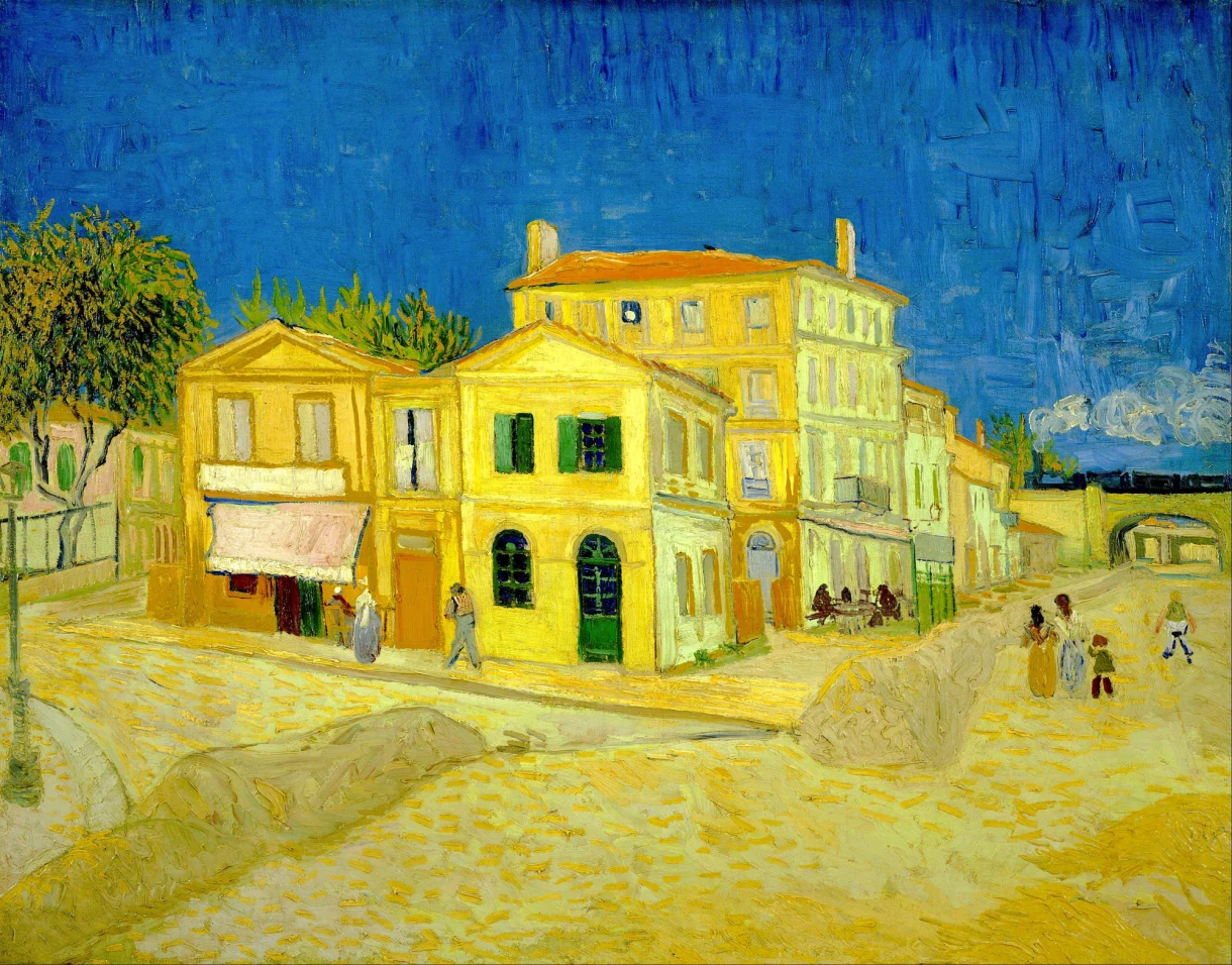


Left to right: Vincent Van Gogh, The Yellow House (1888), The Harvest (1888), Self Portrait with Bandaged Ear (1889), Oil on canvas
"How lovely yellow is! It stands for the sun."
Few artists wielded colour as fiercely as Vincent van Gogh, whose revolutionary approach earned him the title of the 'Father of Modern Art'. Born in 1853 in the Netherlands, Van Gogh lived a life of relentless creative fervour and deep personal struggle. Despite a life burdened by sorrow and loneliness, Van Gogh's work radiates extraordinary love. He displayed tenderness and ecstasy for life, from the vast subject matter of star-studded night skies rendered so exquisite, to intimate portrayals of fading, drooping sunflowers. Ultimately though, it was in Van Gogh's final, darkest years — his yellow period (1888–1890) — that he drenched his paintings in the most vivid golden light.
His last chapter unfolded in Auvers-sur-Oise, a quiet countryside village just 22 miles from Paris. In the fleeting 70 days he stayed there, at The Ravoux Inn, Van Gogh created 80 canvases and 64 sketches — a staggering, almost superhuman output. These final works see the mundane anew: local wheat fields blaze into motion, their tendrils waving like a golden ocean beneath roiling skies. A sloping hillside of gnarled tree stumps, their roots twisting through the earth like veins, becomes a restless, feverish dreamscape.


To this day, Auvers remains a place of pilgrimage for Van Gogh admirers. Visitors can step inside the modest inn where he stayed, wander through the golden wheat fields he immortalised, and stand before the tangled tree roots that became one of his final paintings. Just beyond the fields that framed his last days, you can find Van Gogh's grave, where he lies beside his beloved brother Theo. Not a day goes by where fresh flowers aren't resting there.
Ultimately, Van Gogh's use of yellow was unprecedented of an artist before. But why? Why the obsession with saffron hues? The answer lies, in part, in innovation. Chrome yellow, a pigment made from lead chromate, was the brightest yellow ever known at the time; it was more intense than ochres, richer than lead-tin yellow and far more enduring than plant-based dyes. Van Gogh loved it. He used it lavishly: sometimes straight from the tube, sometimes softened with lead white, or blended with vermilion to create fiery oranges. In Arles, he even painted his entire studio yellow, seeking to live within the colour itself.
Scholars have long speculated on his preoccupation with yellow. Some attribute it to medical conditions — xanthopsia, glaucoma, or a side effect of digitalis, a drug prescribed by his physician. But perhaps the simplest truth is the most profound. Van Gogh was a man who craved warmth in a world that often left him cold. As Paul Gauguin, his friend and fellow artist, once wrote: “He loved yellow, this good Vincent. Those glimmers of sunlight rekindled his soul, that abhorred the fog, that needed the warmth.”
For art investors, Van Gogh's work remains among the most coveted and precious in the world. His paintings are held in institutions like the National Gallery in London, the MoMA in New York and the Van Gogh Museum in Amsterdam. On the rare occasions they appear on the market, they command staggering prices. In 1990, Portrait of Dr. Gachet (Van Gogh's doctor during his time at Auvers) sold for £65 million — a record at the time. Today, it is valued at over £160 million. Were a major Van Gogh to resurface, it is estimated to fetch between £200–300 million, cementing him as a perennial “blue-chip” artist.
Given Van Gogh’s relative lack of fame during his lifetime, very few commissions or signed drawings exist. However, for collectors looking at lower price points, keeping an eye on auction houses for Van Gogh’s drawings or etchings is a wise strategy. In 2008, Christies sold an etching by Van Gogh for £55k — one of only 61 known prints. Alternatively, our expert team can leverage industry contacts to scout out original letters by Van Gogh — of which he wrote many. These deeply personal letters, often filled with intimate reflections on his work and struggles, typically sell for £40k and up.
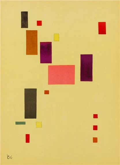
Wassily Kandinsky


Left to right: Vincent Van Gogh, The Sower (1888), The Yellow House (1888), The Harvest (1888), Oil on canvas
Wassily Kandinsky, the so-called 'Trailblazer of Abstraction', was born in 1866 in Moscow and spent much of his early life at the crossroads of a rapidly shifting Europe. Trained in law and economics, he seemed destined for a conventional career — until a single encounter with Monet’s Haystacks in 1895 changed everything. Kandinsky was astonished that a painting could be so imprecise: “It was from the catalogue I learned this was a haystack. I was upset I had not recognised it. I also thought the painter had no right to paint in such an imprecise fashion." At the time, few painters had strayed so boldly from realism.
Abandoning law, he moved to Munich, where modernism was in full bloom. The city pulsed with radical experimentation, alive with new ideas in art, music, and literature. Raised in a household steeped in music, Kandinsky immersed himself in the symphonies of Wagner and Schoenberg — composers who dismantled traditional harmony yet still conveyed profound emotion. If music could transcend structure, so could painting.
His experience of synaesthesia — a rare neurological condition in which sensory perceptions intertwine —reinforced this belief. Kandinsky heard colour and saw music. Spurred on by the intellectual upheavals of his time, he developed a visual language that mimicked the immersive qualities of sound, formalising his theories in Concerning the Spiritual in Art (1912). Blue was deep and spiritual; red, restless and forceful. But yellow held a singular power. It was “earthly” yet carried a "spiritual warmth" — forceful, stimulating, "advancing towards the spectator." He likened it to a “shrill horn” or a “high-pitched flourish of trumpets,” its energy vibrating outward in a centrifugal force (Concerning the Spiritual in Art, p.63).
“Colour is a power which directly influences the soul”

This philosophy finds its most striking expression in Impression III (Concert) (1911). Inspired by a performance of Schoenberg’s, the painting is less a depiction than a sensory translation — an explosion of form and feeling. Yellow dominates the canvas, breaking free in jagged bursts, mirroring the disruptive energy of Schoenberg’s music. These luminous shapes radiate outward like sound waves reverberating through space, clashing against a pool of shadowy black. Splashes of red, blue, and violet punctuate the surface, echoing the music’s tonal contrasts, while sweeping black arcs hint at an audience, absorbed in the raw, unrestrained sound.
Kandinsky approached painting with the precision of a composer, constructing visual harmonies that pulsed with rhythm and intent. While his radical approach was not, and is still not immediately understood, it's made all the more cohesive when experienced in tandem with the music that inspired it. Ultimately, though, Kandinsky's work marked leaps and bounds for broadening the horizon of what art could be, securing his place as a cornerstone of art history and making Kandinsky works some of the most coveted in the art market.
Wassily Kandinsky, the Father of Abstraction, remains a cornerstone of modern art investment. His works are institutionally held by the Guggenheim, Centre Pompidou, and Munich’s Lenbachhaus, limiting private market availability. When high-quality pieces surface at auction, they attract fierce bidding — his record stands at £36 million for Murnau mit Kirche II (1910).
His seven Composition paintings (1907–1939) are most sought after, but investors with lower budgets can consider Kandinsky’s woodcuts, ranging from £200 to £10k. Provenance is key, and our curators negotiate pricing while verifying authenticity with experts. Collectors are also drawn to his theoretical writings and ephemera — signed editions of Concerning the Spiritual in Art (1911) and Bauhaus-era documents hold strong value. In 2022, a signed Kandinsky document sold for £2.5k.
Mark Rothko


Left to right: Mark Rothko, No.5/No. 22 (1949), Untitled (1950), Untitled (Yellow, Orange, Yellow, Light Orange) (1955), Oil on canvas

Few artists have stripped painting down to its essence like Mark Rothko. Born Marcus Rothkowitz in 1903 in Dvinsk (now Latvia), his early years were shaped by displacement — his family fleeing persecution and emigrating to America when he was ten. In this new world, he wrestled with cultural dissonance and a search for meaning that would come to define his work.
By the mid-20th century, the world was shifting. Freud and Jung had opened new pathways into the subconscious; war had shattered old certainties, leaving a hunger for essential truths. Abstract Expressionism emerged in response, and Rothko stood at its centre. Yet, while his peers favoured dynamic, gestural brushwork, he turned inward, developing colour-field painting — expanses of luminous pigment that seem to hover, pulse, and envelop the viewer in pure emotion.

Rothko wanted his paintings to be sites of meditation. To deepen their immersive quality, he softened the edges between colour fields, dissolving boundaries to create a hypnotic, atmospheric effect. He was equally meticulous about lighting, adjusting each display site to evoke a ruminative atmosphere. Nowhere is this more evident than in the Rothko Room at Tate Modern, where vast canvases surround the viewer, their colours shifting in the dim light. Visitors sit in silence — some cross-legged on the floor, meditating; others gazing, transfixed.
Yellow plays a vital role in Rothko’s palette, counterbalancing the weight of his favoured reds and blacks. In No. 13 (White, Red on Yellow), a mustard expanse serves as both foundation and atmosphere, pressing against the forms above. A deep, dense blood-red looms at the bottom, while a gauzy white floats above — soft, diffuse, almost receding. Rothko saw colour as unfixed, always shifting in relation to its surroundings.
Though his work may seem obscure, Rothko’s paintings belong to a long tradition of artists capturing the sublime, from Titian to Turner to Reynolds and Kant’s philosophy of the ineffable. His vast colour fields surround the viewer in something raw and infinite, quite dwarfing — akin to standing before a mountain range or the open sea. It’s no surprise that viewers often sit in quiet reverence, some overcome with emotion — natural responses to something boundless, speaking to the primal and universal.
The Rothko market is one of the most tightly controlled in post-war art, with his luminous, meditative colour fields among the most coveted paintings in modern history. Top-tier works consistently sell above $50 million, with Orange, Red, Yellow (1961) reaching £70 million in 2012 and No. 7 (1951) selling for £67 million in 2021. His most sought-after pieces date from 1949 to the mid-1960s — his peak period — when he perfected his signature stacked colour forms. Later works, such as the Black on Grey series (1969–70), remain historically undervalued but are gaining institutional recognition. Rare museum deaccessions create significant opportunities, attracting top-tier collectors.
For more accessible price points, investors can look to Rothko’s fine art drawings, with mid-career examples selling for as little as £19k. Hand-drawn exhibition invitations and original posters offer entry-level options, typically ranging from £1,000 to £2,800. However, provenance is paramount; given the deceptive simplicity of Rothko’s work, forgeries have surfaced, making authentication crucial. At Artelier, our network of industry experts ensures rigorous provenance research for Rothko acquisitions. Get in touch to learn more.
Christo & Jeanne Claude
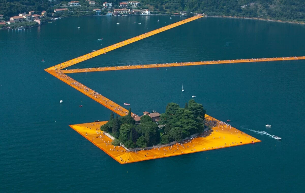


Left to right: Christo and Jean-Claude, The Umbrellas (1991) in Japan (Ibaraki) and the USA (California), The Floating Piers (2016) in Lake Iseo near Brescia, Italy, yellow fabric public art installation

Art was never meant to last for Christo and Jeanne-Claude. It was meant to appear, astonish, and disappear — leaving behind nothing but memory. Born on the same day in 1935, they spent their lives wrapping landscapes, monuments, and entire cityscapes in fabric, transforming the familiar into the extraordinary. Their projects were monumental in scale but temporary by design.
Christo Vladimirov Javacheff, born in communist Bulgaria, and Jeanne-Claude Denat de Guillebon, raised in Moroccan aristocracy, met in Paris in 1958. Their first encounter was almost accidental — Jeanne-Claude’s mother, intrigued by Christo’s work, commissioned a portrait. When Christo later invited Jeanne-Claude to his studio, she caught a glimpse of stacked, wrapped objects. “My God, this guy is crazy,” she recalled. But their partnership was instant. Christo taught her art history; she challenged him to think bigger. What if a car were wrapped? Or oil barrels? Or even a monument? These questions shaped the radical scale of their life’s work.
"We wish to work in total freedom"

Realising their ideas, however, meant battling bureaucracy. Securing permits could take decades, and every project required meticulous planning and self-funding — refusing sponsorships or future commissions. But impermanence was the point. “Freedom is the enemy of possession," Christo told National Geographic. Their installations were vast, immersive, and profoundly interactive and ultimately meant to be experienced in the moment.
The Floating Piers (2016) was among their most ambitious. For 16 days, a luminous saffron walkway stretched across Italy’s Lake Iseo, linking the mainland to the islands of Monte Isola and San Paolo. As visitors walked, the fabric shifted beneath their feet, rising and falling with the water; as though the artwork was living, breathing thing. “For 16 days, they will walk on water!” Christo declared. The golden pathway glowed against the deep blue of the lake, its intensity heightened by the complementary contrast—a shifting, ephemeral mirage.
This dialogue between landscape and movement was also at play in The Umbrellas (1991), an immense, dual-country installation that cost $26 million to complete. Spanning across California and Japan, it saw Christo and Jeanne-Claude planting 3,100 giant umbrellas: yellow in the sun-scorched golden hills of California, blue in the damp, rolling landscapes of Japan. The effect was striking: thousands of vibrant canopies swaying in the wind, bridging two places through a shared experience. The blue sunk into the skyscape, reflecting the changing hues from daylight to night. And yellow, a colour of vitality, energy and impermanence, was the perfect hue for something meant to shine brilliantly, then disappear.
For collectors, the ephemerality of Christo and Jeanne-Claude’s work makes preparatory pieces — drawings, collages, and concept sketches — the primary means of acquiring their legacy. Scarcity has only heightened their desirability, with major institutions like the Centre Pompidou and the Met holding key works. At auction, these pieces command high prices; in 2021, a preparatory drawing for The Umbrellas (1985) sold for £1.7 million.
For more accessible entry points, collectors can look to studies, limited edition prints, signed photographs, and project-related ephemera. The Mastaba studies have sold for £10k-£30k. while The Umbrellas signed lithographs typically range from £30k-£70k. Even exhibition postcards and catalogues, particularly signed, hold value, with some fetching £1k–£10k. Given the prevalence of forgeries, provenance is paramount. Contact Artelier to learn more about our secure authentication services.
Olafur Eliasson
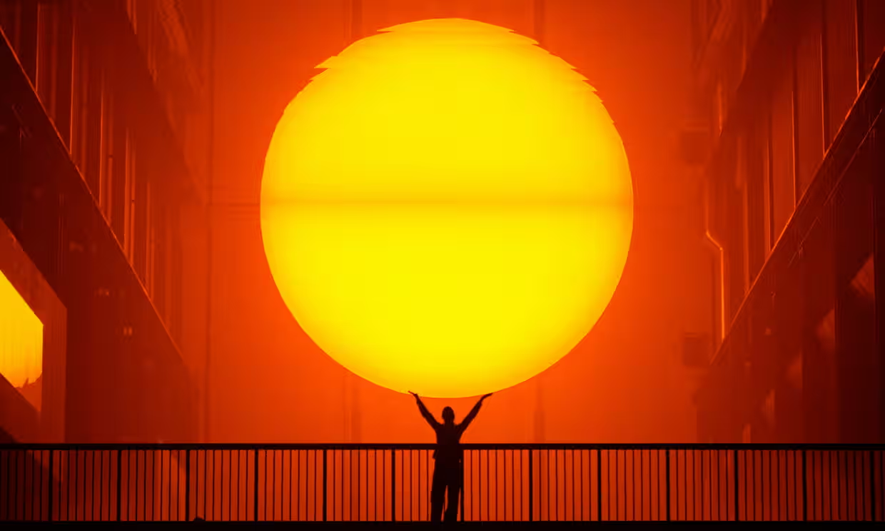
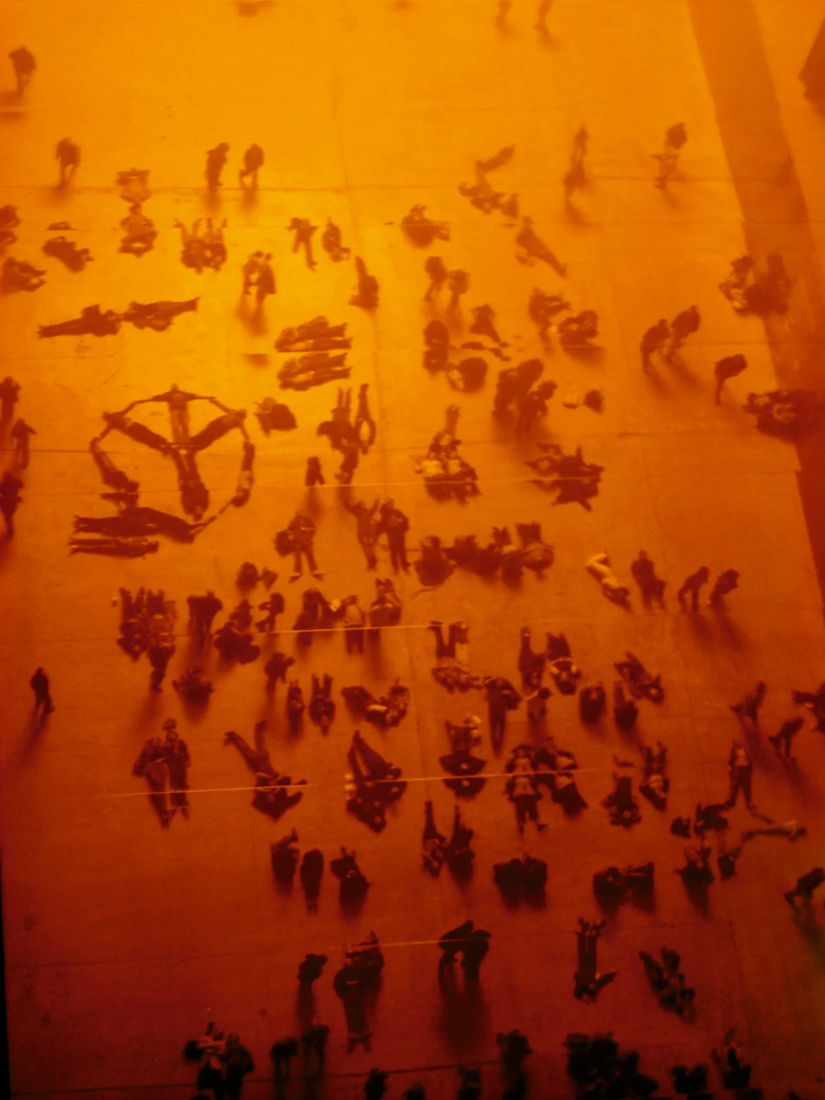


Olafur Eliasson, The Weather Project (2003) at Tate Modern Turbine Hall, digital light art with mirrored ceiling
Olafur Eliasson reactivates the familiar into the extraordinary. Born in 1967 in Denmark but deeply shaped by
Iceland's otherworldly landscapes, Eliasson grew up surrounded by the simmering cauldrons of hot springs, volcanic terrains and the luminous Arctic sky. These natural phenomena — charged with light, energy and the mysteries of transformation — left an indelible mark on his artistic vision.
By the late 1980s and early 1990s, Eliasson was already experimenting with light, exploring its ability to shape perception and experience. He deliberately created works that relied on presence and interaction, i.e. pieces that could not be passively consumed or easily bought and sold. This resistance to the increasing commercialism of the art world set him apart, positioning him as an artist who prioritised engagement over ownership.
For Eliasson, yellow is more than a colour; it is a conduit for perception. It embodies the warmth of sunlight while challenging us to question how we interpret light and space. His iconic Weather Project (2003), housed in Tate Modern’s vast Turbine Hall, enveloped visitors in a golden haze. A colossal, glowing orb dominated the space, its light dissolving the boundaries between art and life. Visitors lay on the floor, gazing at their own reflections in the mirrored ceiling, becoming part of the work itself. This shared moment of awe transformed the industrial space into something elemental — at once sunrise and sunset, presence and impermanence.
"What makes creativity is not the choice between two colours... it is the consequences that the choice has on the world."

In Little Sun (2012), yellow takes on a more tangible and urgent role. Eliasson and his engineer partner, Frederik Otteson, designed and developed solar-powered lamps to distribute to communities in developing countries without reliable electricity, bring light and joy to those who need it. The miniature artworks are practical in essence, giving 10 more times light than a kerosene lamp at cheap prices, but artistic too. As Eliasson pointed out in an interview with the Guardian: "The fact that the lamp had been designed by an artist is important. People want beautiful things in their lives; they want something that they can use with pride … everyone wants something that's not just about functionality but also spirituality."
Eliasson’s work resists the confines of conventional art-making. It spills into architecture, ecology and collective action, merging the aesthetic with the ethical. Yet despite these weighty themes, a sense of wonder endures. Whether conjuring rainbows, refracting light, or immersing us in fields of colour, his art is never just spectacle — it forces us to look harder, not just at art, but at the world itself.
Olafur Eliasson’s market holds a unique position in contemporary art: deeply conceptual and immersive, yet structured for serious investment. Unlike artists reliant on paintings or sculpture, he has translated his large-scale light installations into collectible formats. His sculptural works — glass orbs, kaleidoscopic mirrors, and refractive light pieces — are highly sought after, often commanding six-figure sums. His Colour Experiment series, inspired by prismatic light effects, offers a more accessible entry point at £50,000–£150,000.
Institutional backing from MoMA, Tate, and the Guggenheim reinforces his long-term value. For collectors at lower price points, limited-edition prints, signed photographic works (£1,000–£3,000), and smaller sculptures present strong opportunities. As his market expands, provenance and authentication will grow in importance. Eliasson’s interdisciplinary approach — bridging art, science, and sustainability — sets him apart, appealing to institutions and collectors alike. With rising demand for experiential and socially engaged art, his market remains poised for continued strength.
Conclusion

“Some painters transform the sun into a yellow spot. Others transform a yellow spot into the sun.”
Yellow is a colour of paradox — radiant yet volatile, signalling both dawn and dusk, splendour and decay. It is the colour of transformation, never still, always shifting between brilliance and shadow. For Vermeer, it was the hush of afternoon light suspended in time. For Van Gogh, a fevered necessity to banish darkness. For Kandinsky, a trumpet blast of pure sensation. For Rothko, a portal to the sublime. For Christo, a luminous embrace of the landscape and for Eliasson, the sun itself, reimagined within our grasp.
To own these yellow masterpieces is to preserve a kind of alchemy, pigments that once burned bright but are now extinct. Some of the most radiant yellows ever created have vanished; they're too toxic, too unstable, or lost to time. The luminous lead-tin yellow Vermeer used disappeared from artists’ palettes after the 18th century, replaced by safer alternatives. The brilliant chrome yellow Van Gogh loved was later abandoned, prone to darkening and laced with lead toxicity. These lost pigments make the works that contain them even more valuable: rare windows into vanished colour worlds, preserving something we can never fully recreate. Just as art captures emotion, time and place, it also preserves material history — fossilised traces of light, held on canvas.
Ultimately, though, yellow is more than pigment. It alters perception, sharpens focus, lifts the spirit. Like sunlight, it carries an almost medicinal effect on the mind, enhancing creativity and concentration. Just as sunflowers arch their petals to follow the sun as it moves across the sky, we too are drawn to the rising and setting of light. It is the giver of all warmth, radiance and renewal. To collect yellow is to collect light itself — curative, a necessity, the quiet vitality of life made visible. Without it, we are shrouded in darkness.
We all need a yellow artwork in our lives.
Discover Artelier’s 'Art Concierge’ and expert services for collectors by visiting our page here, or alteratively, reach out to begin your art investment journey with our team of dedicated experts.

Calypso Lyhne-Gold
Curator, Art Researcher & Editorial
Calypso is a passionate art-writer with extensive experience in artist liaison, investment art analysis and curation. Calypso has written extensively for Artelier and leading galleries, combining deep research with a keen understanding of global artistic trends and a rigorous approach to art market analysis.